Showing posts with label typography. Show all posts

22 October 2009

Color Theory

Below are some color studies I made with a sketch for a friend. for each set, the color of the letters CG are exactly the same, but because of their background, they look different. I forgot how much I love color theory :)


27 August 2009

My Early Lettering Years

I've been on a mission to track down some of my biggest design influences throughout my life. I'm looking for the resources I grew up with, or used that helped shape my artwork or design work. All the stuff I looked and and kept around me before I knew about design, before I went to school, and before I saw work of famous designers.

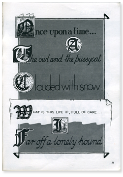
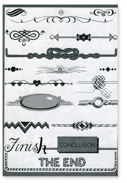
When I was about 11 or 12, I remember having this book, The Do-It-Yourself Lettering Book. This was my favorite book at the time, I carried it around EVERYWHERE. Surprisingly, it is still in decent shape and well preserved. I view this book now as my early introduction to lettering and the beginning of my lettering obsession. I can remember drawing just about everything inside of this book, and viewed every project, poster, or report as a chance to do some unique lettering. If only I had some of those reports! (Specifically, a poster about Rhode Island I made in the Second Grade. I loved RI, so much that I started a mini singing group called Rhode Island Rats with my friend Laura. The only words to our song was, Rhode Island.)

Anyway, in high school, my notebooks and book covers were completely covered in lettering. Mostly bands that I liked (which are probably embarrassing to mention now :) ). Each word was written in a different way and were probably 100% inspired by this book. This style of lettering still shows up in my 
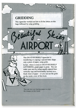
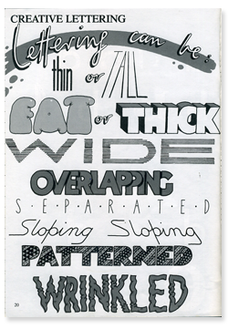
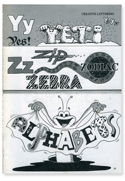
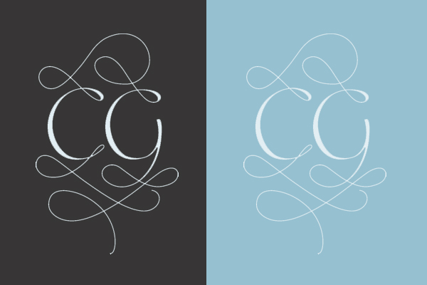
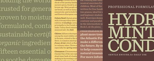
meeting notes

A few pages from The Do-It-Yourself Lettering Book:


07 August 2009

Signs!

Awww these signs make me miss working at the sign shop! I <3 these!


27 May 2009

Money!

Ahh, the economy has gotten everyone thinking about money. Some people are finding creative ways to change the economy by focusing literally on money. Detroit Cheers are making their way around town in an attempt to keep American dollars in the city. This was a technique used in the Depression Era and has really created a tight community between Detroit businesses. Read more about it at Model D

Detroit Cheers


I also just heard about a design contest to design new money for the United States. It is something that was started by the people, and has not been made official by the government, but it is definitely an interesting project that should be given some attention by designers. Their idea is that if we make money shinier (more stimulating) then people will use it more, thus stimulating the economy a bit. ;) Read more about it here

Since we're on the topic of money, I thought I would make note of the beautiful guilder notes from the Netherlands, designed by Ootje. They have since been replaced by the Euro :( check them out, they are beautiful! Read more about them here


13 May 2009

A slab serif font that wont leave you for dead!

H&FJ has done it again! They just posted their new typeface, Sentinel. Below are some of the samples they have made for the new typeface, simply beautiful <3


11 May 2009

How-to Cursive!


And! If you want to know what your cursive means, check out this free handwriting analysis tool